
Responsive website to Figma
Review the same page across desktop and mobile without rebuilding each layout. Capture multiple widths, add supported Light and Dark appearances, and compare the results in Figma.
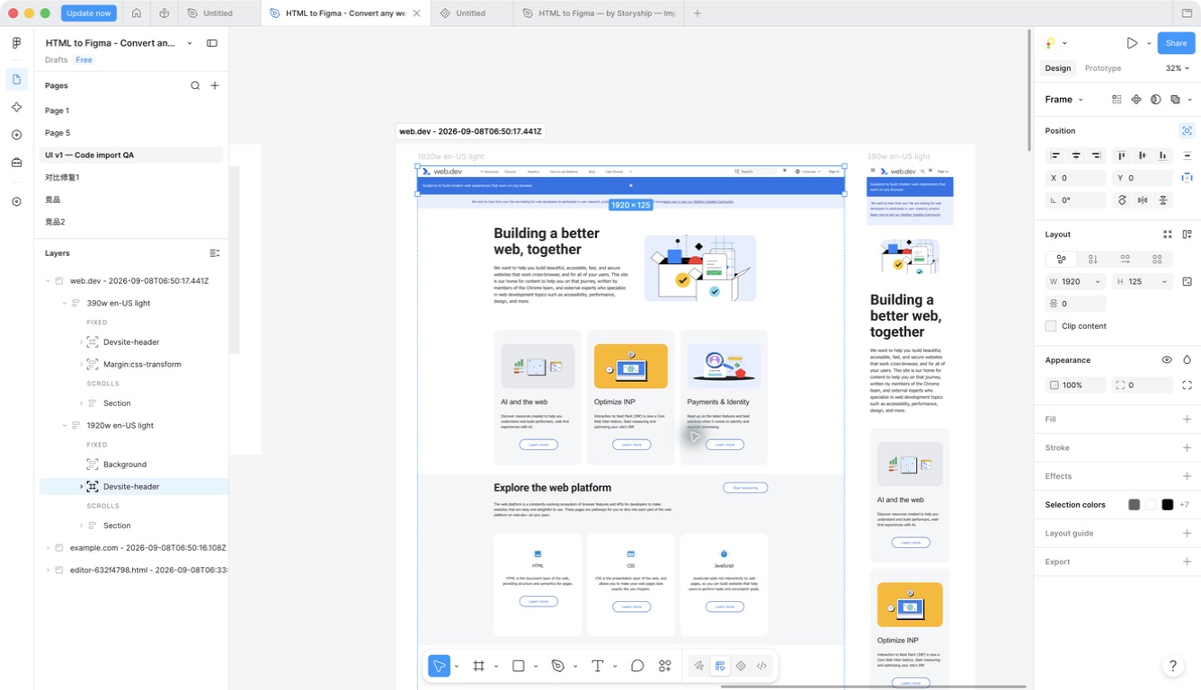
Choose widths that match your review
Open the plugin's capture settings from the settings icon. Select the widths you need and edit the values to match the source website's breakpoints. The standard choices include desktop, laptop, tablet and mobile sizes.
Begin with a desktop and mobile width, then add intermediate sizes when a navigation change or column transition needs a closer look. Each selected size creates its own captured result rather than stretching one screenshot.
A responsive website to Figma workflow is most useful when you compare actual changes: where cards stack, how headings wrap, which navigation is visible, and whether the footer remains complete.
Light and Dark are capture inputs
Select Light, Dark, or both before capture. The source page is rendered with the requested color-scheme preference. A page with theme-aware CSS can then produce separate appearances.
Some websites use a custom theme switch or ignore the browser color-scheme preference. Identical Light and Dark results can be valid for those pages. The plugin does not promise to invent a dark design for any website.
The browser extension's available options depend on its released version. Its locally downloaded capture is imported as captured; choosing a new theme afterwards cannot reconstruct missing source states.
Keep the capture matrix intentional
Two URLs, two widths and two themes normally request eight webpage captures. Adding languages multiplies the work again. Use only the combinations that answer a design question, especially for long or asset-heavy pages.
Language selection negotiates the page locale; it is not an automatic translation service. A site may return the same language when it does not support the requested locale.
Review dimensions and labels together. Source media queries, font substitutions and unavailable assets can affect the layout. A mobile capture should be judged against the mobile browser state, not just the desktop frame.
A starting point for responsive design QA
Supported text and layout structures become editable Figma layers. Auto Layout can map compatible Flex and Grid patterns, but each capture remains a specific rendered viewport. Importing several sizes does not automatically create a complete responsive component system.
Use the results to inspect spacing, compare production against a design, or prepare a redesign. For another pass, re-import a managed result rather than manually rebuilding the page.
Save frequently used capture settings as a JSON preset when your team needs a repeatable review setup. Presets share settings, not page contents or a central team policy.
FAQ
Questions before you import
Practical answers for responsive capture.
Can I use custom breakpoints?
Yes. The plugin's viewport settings let you edit widths and select the sizes to capture. Use widths supported by the settings validation.
Why do Light and Dark look identical?
The page may not respond to the browser color-scheme preference. A theme label describes the requested capture input, not a guarantee of visibly different colors.
Does the language option translate a website?
No. It requests a locale from the source site. The site's own localization determines the content returned.
Do I receive one responsive component?
No. You receive separate captured viewports with editable supported structure. Auto Layout and component options have their own compatibility boundaries.